How Effective is Data Visualization?
We’ve all encountered those data-heavy reports that leave us feeling disengaged and overwhelmed. This often leads to crucial insights falling through the cracks. Now picture the same data presented in pie charts, graphs and word clouds! Much more effective right? 63% of business leaders believe data visualization helps them identify insights they may have missed otherwise!
Data visualization is the representation of data through use of graphics such as charts, plots and infographics. It allows you to present complex data relationships and insights in a way that is engaging and easy to understand. It is particularly useful for identifying patterns and trends in large data sets. In fact, 72% or organisations report that they can access insights faster, sometimes even in real-time, after implementing data visualization tools!
While traditional methods include charts, graphs and tables, what if you could get more creative and tailor your reports to your brand with personalized infographics?! Well look no further!
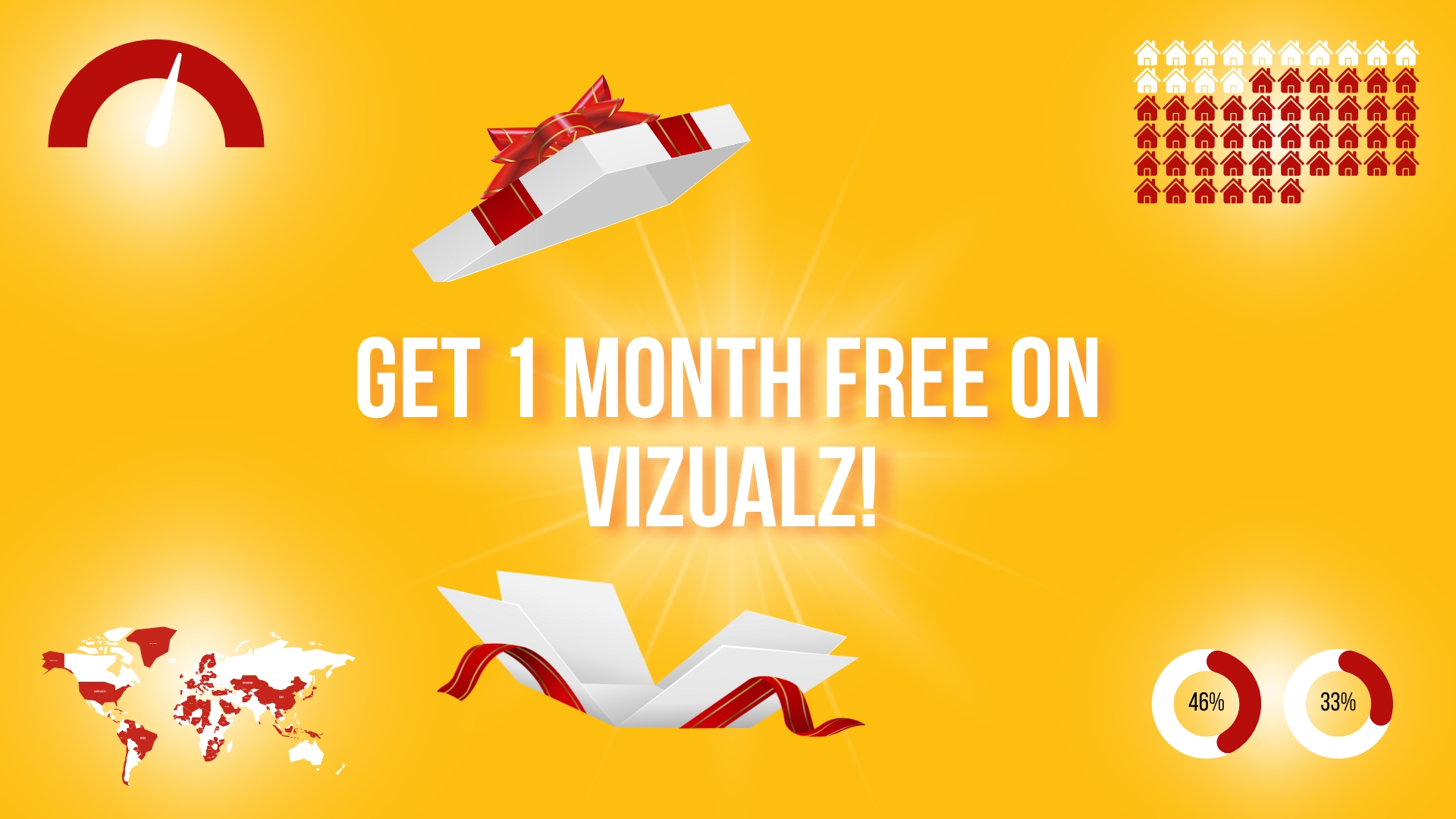
Vizualz LIMITED OFFER For New Users! Get PowerPoint Infographics in Seconds…
This February, we are doing a limited offer on our PowerPoint infographics tool, Vizualz. All new users get 1 month free on the monthly subscription!
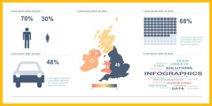
Vizualz is a PowerPoint plug-in that enables you to quickly and easily display your data in an eye-catching manner directly within your familiar PowerPoint slides. You can choose from hundreds of our built-in icons or import your own brand logos, icons and pictures so you can tailor your reports to your client’s brand!
Create a whole range of infographics including:
- Filled images
- Repeated images
- Proportional images
- Gauges
- Maps
- Word clouds and more!
Offer expires at the end of February! Don’t miss out.
GET PROMO CODE NOW!