

Struggling with your data visualization?
Don’t worry, our data viz team put together a guide to help you start creating engaging and meaningful visualizations.
The need to create more visually engaging reports has become ever more compelling. Traditional slides of unstimulating charts, tables and walls of text are now being replaced with more visually captivating representations of data. Audiences now want to engage with a story, that allows them to clearly see insights and to plan for any outcomes. Poorly designed reports can cause audiences to misunderstand your data and eventually lead to incorrect interpretations and poor decision making. Our Data Viz experts came up with a guide to enable you to get the best results out of your data visualizations!
Have a clear idea of your audience and what you want to show them before you start
When creating visualizations, one size does not fit all, so you need to understand your audience and build to their preferences/understanding. It is imperative that you identify the audience, recognise the challenges they are facing, and create your report to allow them to solve these challenges. Don’t use the same template and design for all situations and clients. By understanding your audience, the report that you produce will be tailor-made, and the visualizations you have chosen will be meaningful to your audience. Knowing all this before you start will inform all stages of production and be a lot easier than trying to modify things later.
Keep visualizations straightforward and easy to interpret
Ensuring that the audience can easily process what you are presenting is very important. Being able to interpret the data quickly is important to allow busy decision makers to make decisions and create outcomes efficiently. Often the amount of ‘visual’ time you’ll get can be measured in seconds. So, avoid trying to use fancy visualizations, which often get in the way of showing clear and concise data. The visualizations that you use should be clean, simple and easy to digest. Just because something looks cool and bright doesn’t mean that it’s the right thing to use for the given context.
Keep the user engaged
Human beings are naturally visual beings. To ensure that your audience remains engaged throughout the entire presentation, use great looking visualizations. Also, make sure you keep to a clear storyline of what you want to show with your data! Don’t just show a collection of charts without any coherent narrative. If you are presenting a customer survey about a shopping experience, you could start the story with the first location the respondent was asked about. Start with the ‘shop front’ or ease of finding suitable parking, and then move on to the ease of finding the desired aisles and products, range of available products, ease of finding staff to assist, ease of checkout process etc. Alternatively, you could structure your presentation to start with the high scoring areas and then move on to those that require more improvement. This technique gives the audience a clear pathway, keeping them engaged.
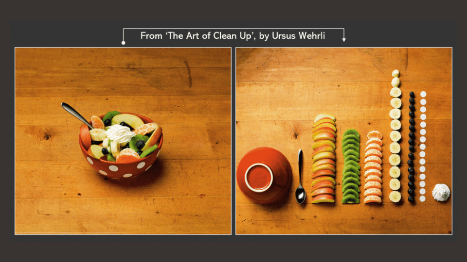
Don’t cram!
Data Visualization is all about expressing your data whilst keeping it easy on the eye. By cramming in too many charts you can cause the audience to miss the clear story you want to convey. In the worst case you will even cause them to lose interest. It is advisable that the report is spread out over multiple pages, slides or canvases. This allows the report to keep a good flow, and most importantly, makes it easy for the audience to focus on one thing at a time! In addition, use text sparingly and use space to emphasise key points. Remember, if the viewer must scroll then it’s an indication there is probably too much there!
Developing and sticking to a visual language
When building reports, whether in PowerPoint or via a dashboard tool, colour can be a very effective tool when used correctly. When misused, colour can cause the viewer to become confused and ultimately lose interest. When using different colours, ensure that the difference between them is easy to see. When colours are too similar, for example light red and pink, it becomes difficult to distinguish between them. This is the case for all people, but especially for those who are visually impaired.
Also, use colours consistently and correctly. For example, only use red for bad/warning, and green for good. If you were to use the colours the other way around, the audience would naturally misinterpret the data based on the common use of the colours. Once you have decided on your colour palette, make sure that you are consistent. If you’ve chosen a specific shade of green for positive scores, use that shade throughout.
As well as colour, any theme, icons or images that you use should be the same throughout the report. Whatever symbol or picture you choose to use for the key points and sections should always be the one shown rather than having different versions which can be confusing.
Using the right tool
When it comes to building reports, having the right tool for the job is essential. Without the right tool, you could spend hours creating one PowerPoint slide, or dashboard, which has zero visual impact. Even after you’ve got it spot-on, you could spend all that time again when you realise that the numbers that you were using have now changed.
E-Tabs has a data visualization tool called Vizualz, which allows users to create meaningful data-driven infographics at the click of a button. Vizualz is the only PowerPoint plugin that enables you to quickly and easily display and edit your data in an eye catching and engaging manner within your PowerPoint slides. Being data-driven means Vizualz will automatically size or fill objects proportionately to the underlying values saving hours of fiddly manual formatting!
If it’s an online dashboard reporting tool you’re after, check out Iris from E-Tabs. Iris was built from the ground up with survey data and the needs of market research in mind, allowing clients and stakeholders to visualize and interact with key insights in an online environment easily, efficiently and effectively.
Finally, just remember that data visualization can be fun! Visualizations should turn data into insight, telling a compelling story. And with the right tools, any market researcher can achieve great results with minimal effort and training.
With thanks to Marta Blankenberger from RedaviZ for the illustrations and examples provided above.
