 5 Tips to take the pain out of your reporting in 2026.
Reporting in 2026 should not feel painful. Yet for many Market Research Teams, it still does. Despite better data access and smarter tools, there is more pressure than ever to deliver high-quality reports quickly. Manual data entry, fixing formatting, growing data volumes and constant deadline pressure turn what should be a strategic advantage into a […]
 5 Must-Haves in a Report Automation Vendor and How E-Tabs Delivers
Selecting the right report automation vendor is a critical decision for any market research company. The right partner goes beyond saving time for your business, they help improve productivity, accuracy and consistency across the reporting process, allowing you to stay ahead of the curve. Smart research companies look for automation that supports every stage of […]
 Why Every Market Research Analyst Should Automate Decks
Market Research analyst teams are under increasing pressure to deliver more, faster. Internal departments and market research agency departments want up-to-date data on customer behaviour and market shifts to make informed decisions. But when every new dataset requires an analyst to spend hours manually creating charts, adjusting formatting, and quality checking reports, report creation becomes […]
 The Power of Storytelling in the Market Research Industry
The Power of Storytelling in the Market Research Industry Market research reports are often seen as pages of numbers that overwhelm and obscure insights. But, when data is transformed into clear, compelling communication, it delivers true insight. Storytelling is the key to this. Storytelling transforms a report from a static collection of charts into a […]
 The Value of Timely Insights: How Quick Reporting Can Drive Business Success
For many businesses, manual monthly or annual reporting can be a tedious and time-consuming process. Unforeseen circumstances may lead to delays, causing reports to be completed well past their intended timeframe. However, such delays can have significant repercussions on businesses, affecting overall operational efficiency. Timely insights and quick, continuous reports are essential for driving business […]
 What is Google Slides Automation?
Google Slides is a cloud-based alternative to Micosoft PowerPoint for presentations. As part of the Google Workspace, it allows users to create, edit, and share presentations seamlessly online. Over the last couple of years, we’ve seen a growing demand for Google-based deliverables for many reports as an alternative to Microsoft PowerPoint. What if there was […]
3 Ways Market Research Companies Can Gain a Competitive EdgeIn a crowded market research industry, only the bold thrive. Standing out in today’s competitive market research landscape is essential if you want your company to succeed. A strong competitive strategy can differentiate your research services, attract new clients, and build long-term client relationships. At E-Tabs, we’ve identified three core areas that help market research […]
 What is PowerPoint Automation?
Slideshow presentations and reports are a vital form of communication in business and education. In fact, an article published by Forbes in 2023 found that “a terrifying 35 million PowerPoint presentations are given each day to a combined audience of half a billion people.” Yet, creating effective, high-quality presentations can be a tedious and repetitive […]
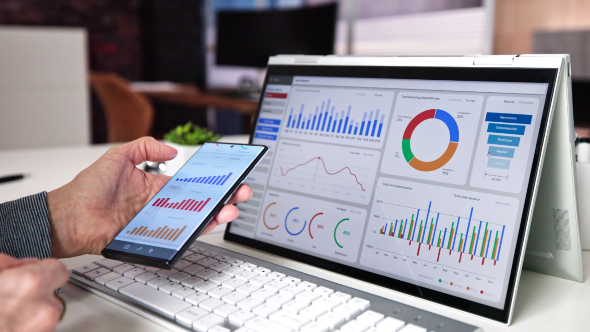 Data Visualization, Best Practices: Simple Tips for Beginners
Data visualization is essential in today’s data-driven world, serving as a graphical representation of information. It simplifies complex datasets, revealing patterns, trends, and anomalies, and turns data into clear, actionable insights for easier interpretation. At E-Tabs, we deeply understand the value of data visualization. We have helped clients generate 100,000s of reports and we have […]
 6 Unique Tips For Effective Deadline Management
Deadlines are often perceived negatively. They can induce high levels of stress and anxiety, especially when tasks are complex, or time is limited. The pressure to meet deadlines can lead to burnout, reduced quality of work, and even health issues! But, what if your deadlines did not evoke chaos? What if you could systemize your […]
