 5 Tips to take the pain out of your reporting in 2026.
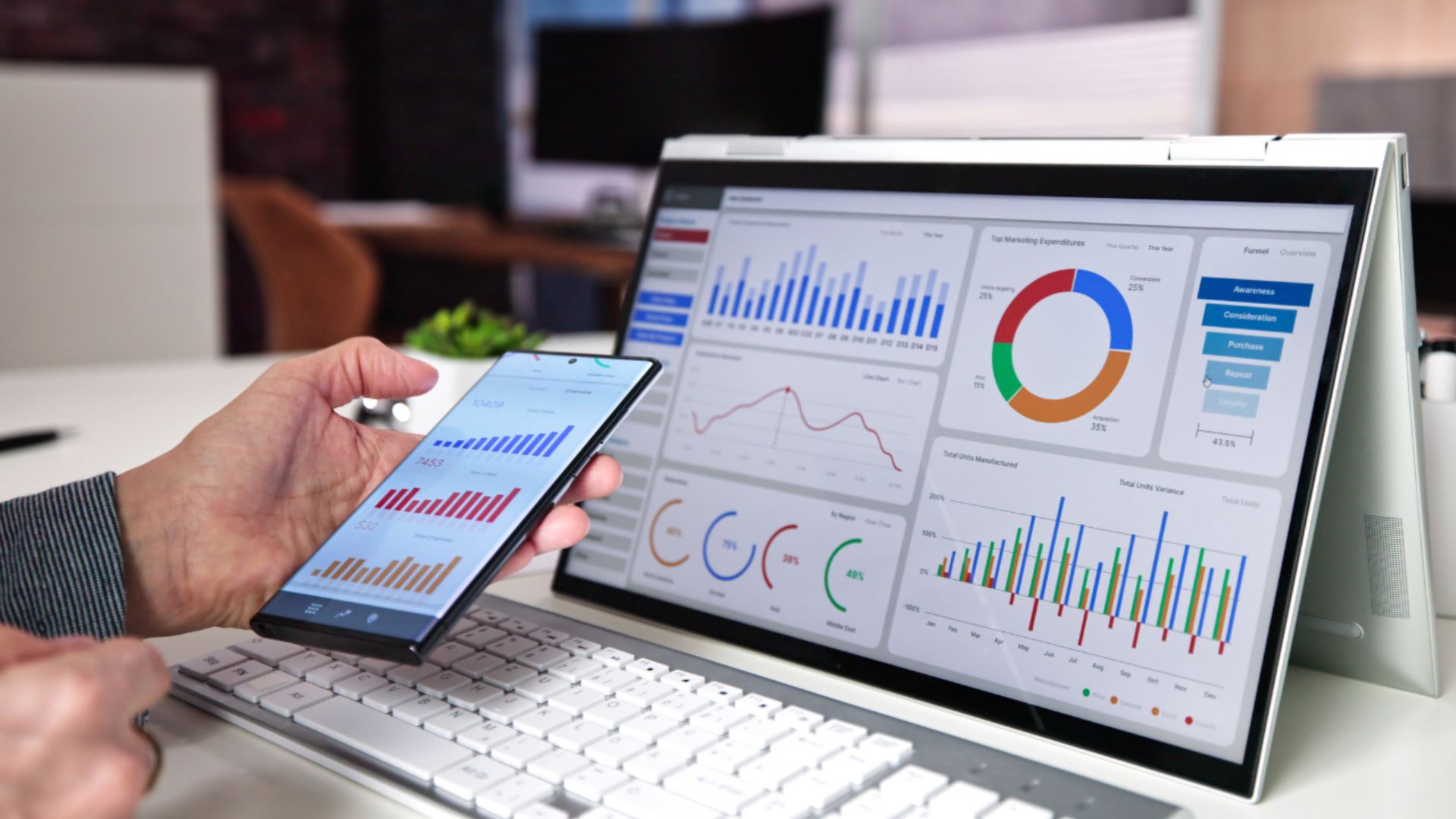
Reporting in 2026 should not feel painful. Yet for many Market Research Teams, it still does. Despite better data access and smarter tools, there is more pressure than ever to deliver high-quality reports quickly. Manual data entry, fixing formatting, growing data volumes and constant deadline pressure turn what should be a strategic advantage into a […]
 Data Visualization, Best Practices: Simple Tips for Beginners
Data visualization is essential in today’s data-driven world, serving as a graphical representation of information. It simplifies complex datasets, revealing patterns, trends, and anomalies, and turns data into clear, actionable insights for easier interpretation. At E-Tabs, we deeply understand the value of data visualization. We have helped clients generate 100,000s of reports and we have […]
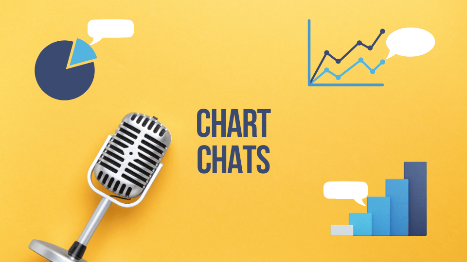 Chart Chats: Inside the World of Data’s Greatest Storytellers!
Welcome to “Chart Chats”, the ultimate gathering of data’s finest emissaries! In this series, we’ll get to the heart of different chart styles to better understand how they tick, through intimate and humorous interviews with the charts themselves. Today, we’re bringing you the bar, the pie, and the line. Strap in for a rollercoaster ride […]
 From Data to Storytelling: Crafting Compelling Narratives with PowerPoint
The impact of Data Visualization in business and industry In today’s data-driven world, the ability to convey information effectively is crucial. But raw data alone often fails to resonate with audiences and key decision makers in the boardroom. This is where the art of storytelling and data visualization comes into play. Storytelling and data visualization […]
 Upcoming Webinar: Elevate Your Reporting!
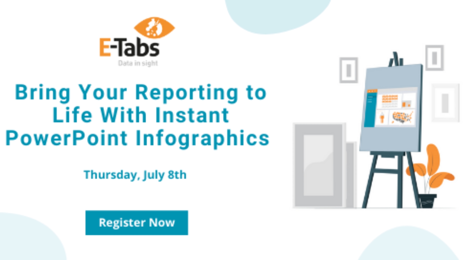
Bring Your Reporting To Life With Instant PowerPoint Infographics! Date: 23rd May 2024 I Time: 4:00PM London, 11AM New York Presented by: Benjamin Rietti, CEO, E-Tabs Join us on Thursday 23rd May to discover how you can elevate your reporting with instant PowerPoint infographics! Ensuring that your research data is more visually engaging and […]
 How to create a word cloud in PowerPoint?
Word Clouds Word Clouds (also known as text clouds or tag clouds) are simple, the more a specific word appears in a source of textual data the bigger and bolder it appears in the word cloud. A word cloud is a collection, or cluster, of words presented in different sizes. It is an effective way […]
 The Importance of Data Visualization
What is Data Visualization? Data visualization changes the way we look at and analyse information using visual components such as graphs, charts and maps. By injecting organic data into lively, graphical presentations, we can better understand and access the trends, patterns and anomalies in any given data. Basically, it makes our life easier. Why use […]
 Bring Your Reporting To Life With Instant PowerPoint Infographics
Bring Your Reporting To Life With Instant PowerPoint Infographics Ensuring that your research data is more visually engaging and easily grasped is more important than ever. Data Visualizations such as proportional infographics, gauges, maps, wordclouds and more, allow you to express the data in a way that’s often easier to comprehend than just typical PowerPoint […]
 We were nominated as a top Data Viz company by Welp Magazine!
We were nominated as a top Data Visualization company by Welp Magazine! Have a read of their article which showcases some of the most popular players in the Data Viz industry. You can read more here. At E-Tabs we have a range of software/services dedicated to Data Visualization. Our dashboard service team can help design, […]
MrWeb Podcast – Discover E-Tabs’ Journey!Benjamin Rietti MrWeb Podcast As part of MrWeb’s Data Visualization special edition, Benjamin Rietti sat down with Nick Thomas for a chat! During this discussion you can find out about Benjamin’s influences, E-Tabs and Covid-19s impact on the industry. If you would like to listen to the podcast – Listen Here. If you would like […]
