

A common concern with PowerPoint Report Automation is whether it will preserve the original design of the template. Some automation tools only support specific chart types or replace native charts with static images. This can alter both the look and functionality of the final report, resulting in a deliverable that doesn’t match expectations.
With E-Tabs Enterprise, Your Design Stays Intact
That’s where E-Tabs Enterprise sets itself apart. Our software creates a direct link between your data tables and the PowerPoint template, maintaining the original design of your slides exactly as intended. Every visual element, charts, layouts and branding remains consistent.
All charts generated through our automation are fully editable, just as if they had been manually created. You retain full creative control over the final output while dramatically cutting down the time and effort needed to produce reports.
Start with a Thoughtfully Built Template
We always recommend building your base template as though it were a final report. Populate it with realistic dummy data to ensure that all layout and design elements are tested properly. This gives you a solid foundation for automation and helps avoid surprises down the line.
Expert Tips: Designing for Automation Success
Here are some key design considerations to keep in mind when preparing your template for automation:
1. Scales and Axes
Inconsistent chart scales are a common issue, especially when charts are reused from other templates. Always apply a consistent minimum and maximum axis range to maintain visual integrity across your slides.
Power tip: We often build in the ability to conditionally adjust axis limits during automation setup. It’s best to consider this from the start, so you don’t have to revise the structure later.
Best practice: Set the max axis to 100% where appropriate, unless a lower threshold makes more analytical sense.

2. Colours and Conditional Branding
Use the colours you expect to see in the final output from the beginning. If charts could potentially display more waves or brands, design them to their maximum expected capacity so the template is future-proof.
- Brand consistency: Ensure that brand or wave colours remain consistent throughout.
- Conditional formatting: Need to colour brands or waves dynamically? Our automation can handle this with conditional logic—just let us know your requirements.
3. Avoiding Overlaps
It’s common to see slides where chart elements—especially bars or lines—overlap when values increase.
- Fix: Watch the chart’s internal margins and how it interacts with neighbouring elements.
- Line charts: Be especially mindful of data labels on line charts. If values change significantly, label overlaps can reduce readability.

4. Use Realistic Values
This ties into the point above, testing with only low or idealised numbers can result in a design that breaks under real-world data conditions.
- What to do: Simulate realistic scenarios in your dummy data to make sure charts scale well and remain visually clean.
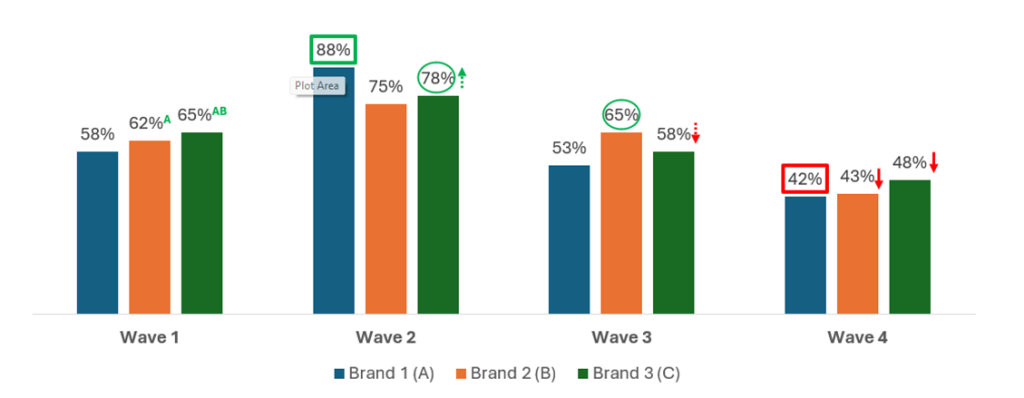
5. Handling Significance Testing
Think carefully about how significance testing will be visually displayed. While some clients want to show significance “to everything,” it’s not always visually practical or insightful.
- Design consideration: Ask yourself how many levels of significance are meaningful, and how they can be displayed clearly on the same data point without cluttering the slide.
Native Charts First, Always
Where possible, build your visuals using native PowerPoint charts. This ensures they remain editable and compatible with built-in PowerPoint functionality, allowing you to make quick manual adjustments if needed.
However, if your design includes more complex visuals or custom-branded styles, we can replicate these as native objects in PowerPoint—or use our proprietary tool, E-Tabs Vizualz, to create infographic-style visuals that remain both dynamic and easy to read.

Final Thoughts
Automation doesn’t mean giving up control, it means gaining back your time while keeping your design, branding, and storytelling exactly the way you want it. With E-Tabs Enterprise, your template becomes the engine of efficient, scalable, and visually polished reporting.
Got a complex template? We love a challenge. Let us help you turn it into a robust, automated reporting solution that works just as beautifully as it looks!
