
In this series, we get to the heart of different chart styles to better understand how they tick, through intimate and humorous interviews with the charts themselves. Welcome to “Chart Chats”.
Today we’re talking to the line chart
Next in line, we have a great interview lined up for you with everything you ever wanted to know about the line chart – It’s line O’clock.
Welcome to the chat line, you seem very familiar, I’m sure I’ve seen you before.
I’m not surprised by that. I’ve had many many roles and appeared in thousands of films and productions. From heart monitor readouts in medical dramas, to scanners in spy movies to the stock market trackers plus many more. There’s pickup lines, putdown lines, lines in the sand and, famously, every cloud has a silver line in!
So you’re an actor?
And a very good one too! Unlike all the other charts who just tell you one boring fact, I tell a story. I follow a metric’s journey along a timeline, showing its ups and downs over time, all the twists and turns of its journey, starting in the past, moving through the present and even into future.
Future? Do you have a crystal ball?
Well, history is a great teacher of the future. Once I get into the character, I find that if you know what’s happened in the past you can continue along the same line into the future with a certain degree of confidence.
So what props do you need to tell a story?
Simply put, the basics of a line chart are data points plotted against two axes – you have the x axis which usually shows time, and the y axis which measures the metric. After you have placed a marker at the metric value for each point in time, you then fill in the gaps by joining the dots with lines.
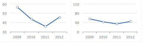
Wow, you say that’s basic, but there is a lot there. Let’s take this one at a time. The Y axis, does it have to start at 0?
Not necessarily. I don’t care about the scale, I’m more interested in the vicissitudes of the metric’s timeline, the ups and downs – the drama, the emotion! If the scale is too large you won’t see any of that. A flatline is a deadline, the audience will fall asleep. Change the scale until you make that line dance.
So no flat lines, is that what you’re saying?
You may have a flat line as a target or something, this is a backdrop for the metric to be displayed against. It provides context for the drama. Even more – you can have a second metric with a different scale in the same chart. It doesn’t matter if one scale thousands and the other is thousandths, the story emerges from the interplay between the metrics, by how they interact and respond to events along their joint timeline. Do they stick together, do they go in different directions, and why? I don’t really explain the why, that’s what the audience needs to do for themselves.
So you can show more than one metric?
Of course! I can technically show as many metrics as you like! Just don’t overload me, I may be the best actor but trying to learn and keep track of too many lines gives me a headache. I start to jumble my lines and it’s too hard for anybody else to keep track of every metric’s individual story either. I normally draw the line at seven. If you have an interactive chart, just show a few and enable the viewer to add and remove or toggle series according to their needs.
What about the X axis? Any words about the scale of that?
Well, your entire life story might be interesting to you but doesn’t make a good storyline for the public. If you are focussing on a few months, then you might get away with daily measurements, but a daily measure over the last 100 years? Really? People won’t sit still for that long. Stick to years or even decades in that case. It’s the direction of the line that matters, not every single peak and trough. Think about a novel, it’s only the important events that get mentioned.
And the line in between the dots, does that have to be a line?
The main thing about that is that it has to join the points. The line could be solid, dotted, dashed or whatever. I know some people go on about their red lines, but just pick whatever colour you want! As for the shape, some people like a line which makes a beeline between the points, but that’s not essential. Try a curve! A smooth curvy line is a real hot line!
And finally the dots?
These are called markers. They could be any shape or size, everything from circles to squares, stars triangles and even images if applicable. Or you could not show them at all! As a general rule, if you have more lines in your chart, your markers should be less visible. Less is more!
I know you like a good story, but what if I only have a single time value for my metric?
One point isn’t a line. It’s a dot. You can show a dot or wait till you get more points further down the line. You can have a slope graph which takes two values, that’s really the shortest story I can tell.
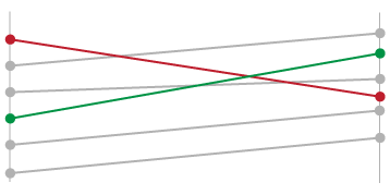 A slope graph
What should I do if I have gaps in the data somewhere along the line?
That is something that I really don’t like, I would send the script back to the writer. I can of course guess at what the metric did during this time, but I can’t always guarantee that I have it right, it’s at your own risk. If you don’t want to rely on my guess and you really can’t get the data, you could leave a gap, and I’ll stop the show at that point. After the interval I’ll resume with ‘1 year later…’. It’s not the most satisfactory but I can only work with what I’m given.
Enough about the characters that you play, what’s going on behind the lines?
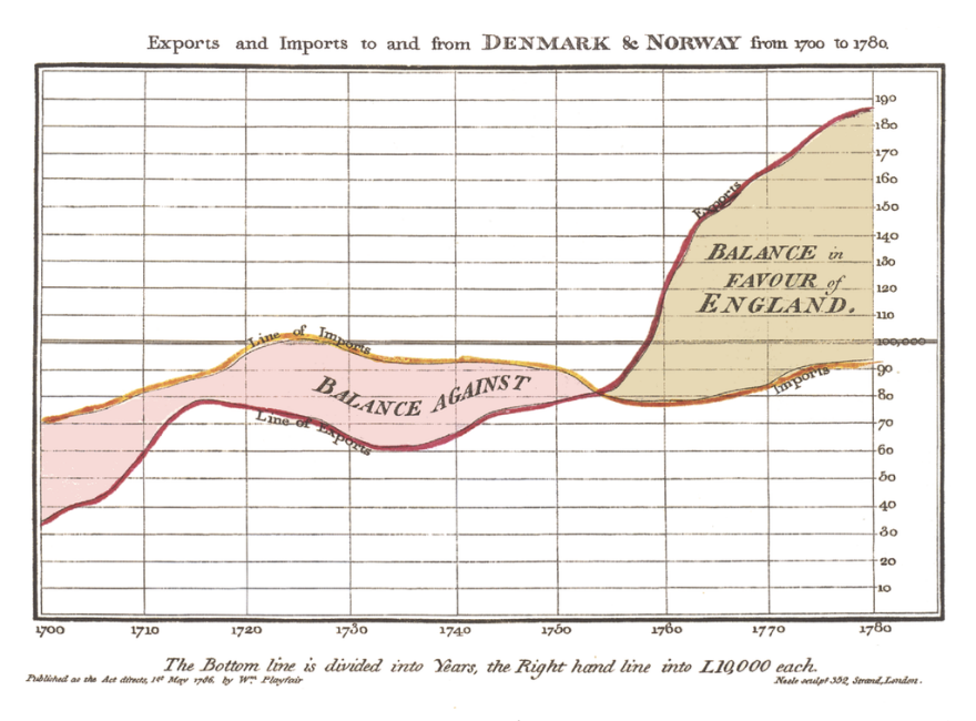
I come from long and distinguished line of charts, dating back to 1786. I was first used to visualize economic based data in the form of imports vs exports annually in the amount of British Pounds Sterling. I’ve been telling data stories ever since, and am famous worldwide. There is lot on the line – did I tell about some of my credits?
I think you did. Do you always play a line?
No, I am quite versatile! I can get rid of the axis and markers and be a sparkline. This is like a 5 minute sketch rather than a whole play. Or I can hang a sheet on the line and be an area chart. Or even a stacked area with many multi coloured sheets. The possibilities are endless.

Sadly we’ve reached the end of the line, what’s the punchline of this chat?
The bottom line is, I’m the best chart to tell your story! Use a line chart properly, don’t cram in too much data, too many lines or markers. Give me a good story that is not too complex, and I’ll be on cloud line and you will be a line king!