
Today we’re talking to the Bullet Graph
Welcome to Chart Chats – this is your opportunity to speak to an audience of MR professionals.
Thanks. I’m glad to have the opportunity – fire away!
You’re the new kid on the block, how does that feel?
That’s true, I was only invented fairly recently by a dataviz expert called Stephen Few. Being new means that people don’t always know how or where to use me which hurts. I may be a bullet graph but my feelings are not bullet-proof. I’m forever standing around at the back of the room just being ignored.
Standing? Do you always stand?
Well, I could be horizontal or vertical. Both are OK for me, I fit in wherever is best. But that flexibility doesn’t seem to make me more popular.
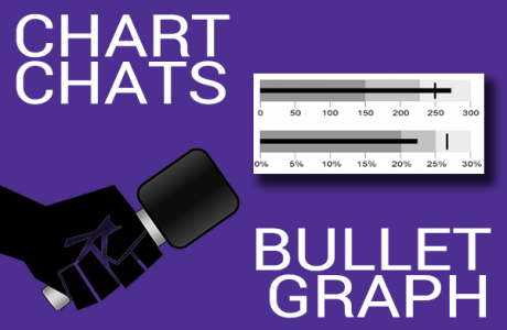
I think part of the problem is that nobody really knows what you are. Are you a bar chart, a gauge or something totally different? I mean, what do all those parts actually mean?
It’s quite simple to explain. The dark centre line is the value to be displayed, just like a bar chart. The background shading shows a range like poor – average – good.
So that’s like you see on some gauges and thermometer charts?
Precisely. And the small line across the main one marks the norm or a benchmark.
Quite simple when you put it like that. Some critics would say that you’re a bit dull, not much colour in there.
The background shading is hues of the same colour to represent negative to positive ranges. Usually, the darker colour is negative as this will stand out more to viewers, and will convey poor performing measure more quickly since this is usually what viewers are more concerned with seeing.
When you say negative I assume you mean low numbers?
Not necessarily, sometimes high numbers are negative. On a scale of one to ten, how awkward is this interview?
I see what you mean. But only one colour?
Well you could do an entire rainbow if you want, but that wouldn’t help the viewer, would it?
I get that. So, the dark centre line represents one value. How would you cope with more than one value?
I don’t! I’m a single value kind of guy, but we bullet graphs are social creatures and you’ll usually find a bunch of us hanging out together. Each one represents a single number, but altogether we make it easy for the viewer to compare multiple measures at a glance. Just make sure that you’ve used the same background shading across all the bullet graphs so the viewers don’t get confused.
What’s your message for our audience?
I’m here – yoohoo! Bite the bullet and start using me! Seriously though, when you use me make sure that all the visual elements are clearly displayed and draw enough attention for the viewer to easily read the chart.
So, in summary, you’re all about showing multiple visual cues at once to clearly and quickly impart how a KPI is performing. Is that the point?
That’s not just the point. That’s the bullet point!