
Chart Chats: Bar Graph
In this series, we get to the heart of different chart styles to better understand how they tick, through intimate and humorous interviews with the charts themselves. Welcome to “Chart Chats”.
Today we’re talking to the Bar Chart.
This week we’re meeting a very familiar kind of chart in a very familiar kind of place, the local bar. Welcome Bar Chart.
Hi! So, I just walked into the bar and the bartender said, “Is this some sort of joke?” *snigger*
Looks like it’s going to be a long night…So, let’s start from the beginning. What is a bar chart?
OK, a bar chart is a visual that displays categorical data in the form of either horizontal or vertical rectangular bars, which allows for quick and easy comparison between the categories included. Impressive, right? Have you spoken to other charts already?
Yes, we have met a few so far.
I bet that they all claim to have been invented by William Playfair. Most people will tell you that the first bar chart is the one he created showing the imports and exports of Scotland by categories, in a timeline from Christmas 1780 to the following Christmas of 1781.
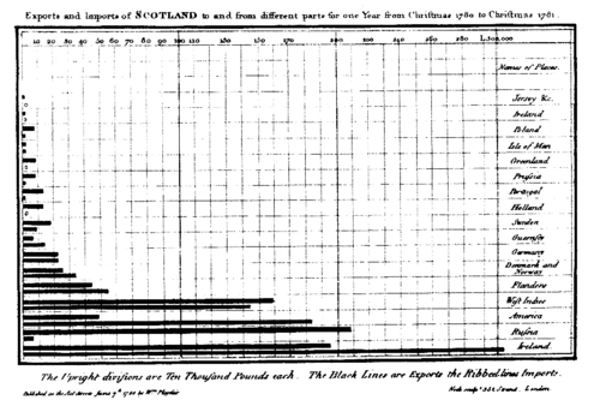
Now, old Bill does get a load of credit but let me tell you something that most people don’t know.
There was a bar chart from almost 300 years earlier from a Frenchman named Nicole Oresme called “The Latitude of Forms”. This example uses bars to represent values of velocity over time of a moving object. The time has been plotted along the horizontal axis, while the velocity values are plotted on the vertical axis. I know it sounds like really complicated stuff, but the point is that the bar chart is actually the oldest chart – don’t forget that!
I reckon that in the stone ages…
Wow, that sounds really interesting but perhaps you could tell me how is a bar made?
How should I know? – You’d have to ask her!! *snigger*
So, where was I? Yes, a bar chart has an X and Y axis, and the height or length of the bar indicates the values they represent for each category. The categories go along one axis and the values along the other.
What about the order?
Thank you very much, I’ll have whatever you’re having. *snigger*
Well, the thing about the bar chart is that you can have whatever order you want, I don’t care. You can sort the chart alphabetically by category or sort by value from highest to lowest, or vice versa.
What about the scale?
Some scales walk into the bar and the barman says, “Sorry about the wait”. *snigger* You get it? Right?
Yes, we get it.
Good. So, scales have to start from 0. I don’t have many rules, but the one rule that I insist on is that all scales start from 0. I don’t care if you go into the minus below the line – the barman here will give me a bit of credit – but you got to have 0 on the scale.
And once you have a scale, keep the same one for all the charts you have.
So, which one is the column, which one is the bar? How do I know which one is best to use?
Oh, who cares, just do what works best for you! That being said, you do get some people who get really worked up about these things. Now the barman here, he really likes the columns – says they keep the roof over his head! *snigger* I personally like to start off vertically, you know, like traditional bar charts should be – that’s the column by the way. As the category labels get longer, I start to run out of room so they start sloping and then they get even longer and it just becomes more comfortable to go horizontal like a bar.
You know, there’s a lot to be said for a bar crawl. I remember when…
Speaking of bar crawls, how many bars should be in a chart?
Doesn’t matter – as many as fit. You just have to watch out for the width and gaps between them. Too skinny a bar width will create dead space in your canvas, which would be better used by other visuals. I always say as a rule of thumb – keep the space between bars half that of the actual width of bars shown.
What happens if I want more than one value per category?
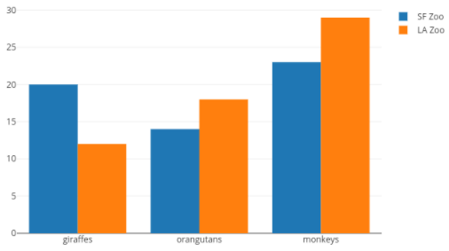
So, then you got a few options. Say you have one value – like this glass here, and then you have another value – another glass here. So, they are next to each other, that’s a group. Then we have one and two in the next category, you see how it works? Now all these multi-value charts will need a legend – so that’s this bag of peanuts here.
Or we could have a stacked bar. We got the same legend – so this bag of peanuts again – but the chart is different. So, the first value in the category is this glass here, then the second goes on top of the first one, and we do same for each category, glass 3 and glass 4.
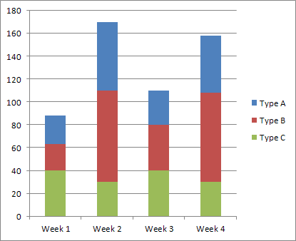
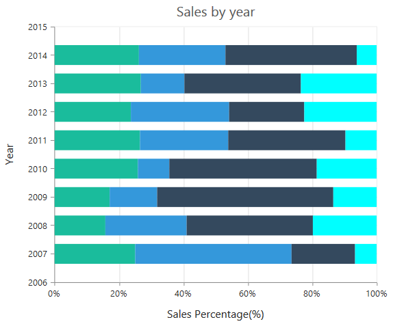
Now, we get to the 100% stack which is when all the values in each category are out of 100, so you have this first value, and then this glass goes on top which is the second value, and then you put the third value on top…
<At this point the barman steps in and removes the glasses>
I see what you mean. Can you tell me…
Hey – my friend the line chart has just walked in. Nice to see you! We drink together sometimes you see.
Oh really? So, where do you two know each other from?
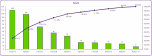
Well, we sometimes work together too, on a Pareto chart – where the bar values are shown in descending order, and the cumulative total of the values shown is represented by the line. This is most useful when there is an interest in showing the relationship between the individual value of a category to the overall total of those categories.
Final words before we leave you two to it?
No 3D charts, avoid that all costs. A 3D chart walked into the bar and the barman said, “You stick out like a sore thumb”. *snigger* And watch your colours, keep all the bars the same colour unless you have a reason not to. And not too much on the chart – if you have scale labels at each interval than gridlines across the chart are not necessary, neither would value labels on the bar. However, you could go in the other direction and remove the axis altogether if value labels are included. And…
OK, so in one sentence?
Watch the scale, keep it simple and basically just keep to the bar code!
Thank you very much.
…Before you go do you want to see my party trick – it’s really good?
I suppose so…
Well, you think bar charts are only squares and rectangles? Actually, I can contort into different shapes, pictures and icons… like this…
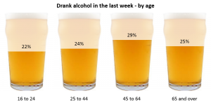
Or this…
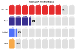
That’s amazing – I wonder if you could show me how you do that?
Actually, it used to be really hard to do. But you are in luck! There’s this brand new visualization tool called Vizualz which allows you – or anybody really – to get these amazing looking charts with hardly any effort at all! Check it out here.
We sure will!